A new home page, with every screen in it
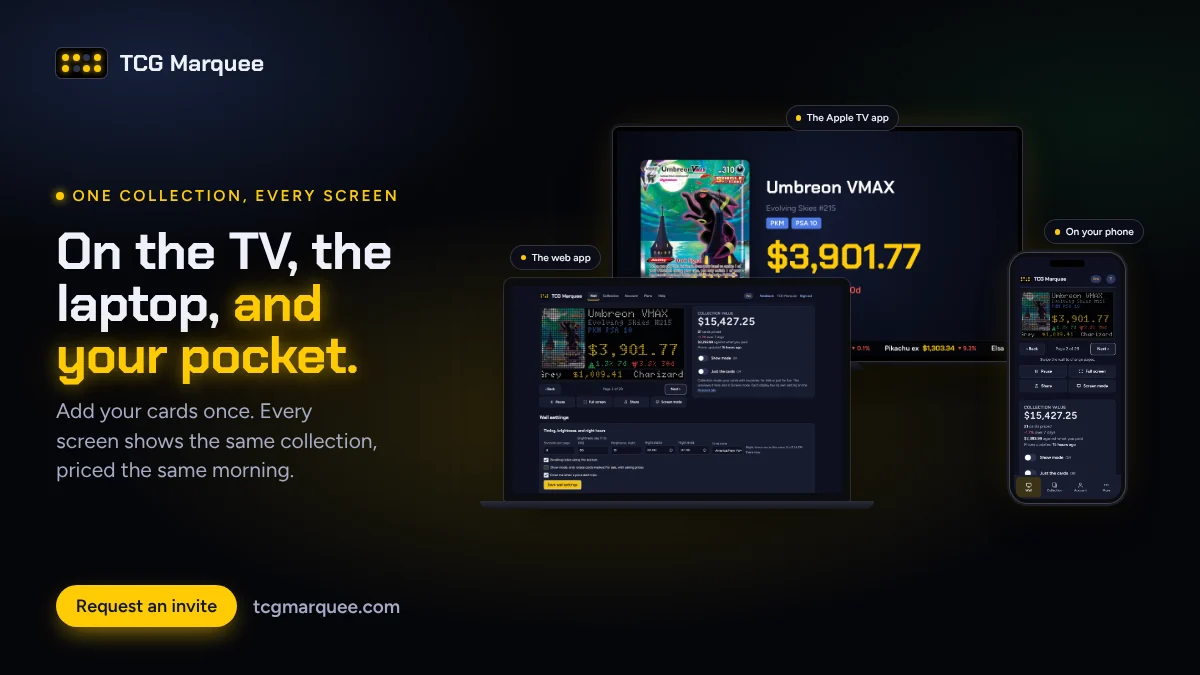
The old home page explained TCG Marquee. The new one shows it. If you're deciding whether to ask for an invite, you should be able to see exactly what you'd get before you sign up, so that's what it does now.
It looks like the board
The page is dark now, on purpose, because that's where a glowing price board looks best. The live LED panel is still front and center at the top, playing this week's biggest movers with real card art, and the six games scroll along under it.
Every screen, in one place
Your collection doesn't live in one place, and the home page doesn't pretend it does. One section puts the same collection on a TV, a laptop, and a phone side by side, priced the same morning:
- The Apple TV app, cycling through a card page (an Umbreon VMAX PSA 10 at $3,901.77), the week's movers, and a binder page.
- The web app on a laptop, with the wall preview and your collection value.
- The app on your phone, the way it looks added to your home screen.
Under that, a short list of where it runs: the LED board (shipping later this year), the Apple TV app (in TestFlight now), any TV or monitor with a browser, and your phone.
Real screenshots of real cards
Every picture on the page is a real screenshot. I set up a showcase account with 20 cards worth looking at: a few slabs, this year's Mega ex chase cards, Enchanted Elsa and Stitch from Lorcana, and The One Ring. Then I took the pictures from the live site and the Apple TV app, prices and all. Nothing is mocked up.
The screenshots are taken by a script, so when the app changes, the pictures can be retaken in a few minutes instead of going stale.
A tour of what it does
As you scroll, the page walks through the features one at a time, with the picture changing beside each one:
- What your collection is worth this morning, with the 7 day change and what you're up against what you paid.
- Every card up close: the price, 7, 30, and 90 day changes, a chart, graded ranges, and PSA population.
- Scanning cards with your camera, slabs included.
- Just the cards: collection mode, a gallery of your binders with no prices at all.
Vendors get their own section
Show mode has its own section now, with the Apple TV showing what a buyer sees from across the aisle: the asking price big, the market price under it, and how far under market you are. It also shows the whole case totaled and your shop page with its QR code.
A fix that came out of it
Taking the screenshots turned up a bug: on a wide screen, the collection table could run past the edge of the page when a card had a long set name, like "Scarlet & Violet Black Star Promos". Long set and printing names now wrap onto a second line, so the table always fits.
Take a look at the home page and tell me what you think, or request an invite if you haven't yet.